Introduction
I am interested in accessibility (a11y) and the patterns and practises I can use to improve the Web sites I work on. For example, I created a React implementation of the roving tabindex pattern. A useful pattern is including visually hidden content on a Web page to help a11y users navigate the page. This is the pattern I am going to discuss today.
Variations
There are two variations on this pattern. The first is when the content is always visually hidden but users with screen readers can always 'see' it. You can use this approach to include hidden information in your Web site. This could provide extra explanations for visually impaired users.
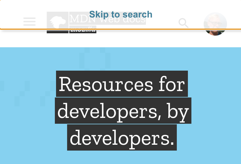
The second variation is when the content is by default visually hidden but it appears on focus. This happens when the user is navigating the page using the TAB key and the content receives focus. The skip link is an example of this. You can see this pattern in action on the MDN Web site. Their home page has a skip link at the top of the page:
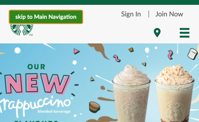
The Starbucks UK Web site has a 'skip to Main Navigation' skip link:
Implementation
Hiding content is not as simple as adding display: none or visibility: hidden. These unfortunately hide the content from screen readers. Bootstrap implements an approach that works in their sr-only SASS mixin:
@mixin sr-only {
  position: absolute !important;
  width: 1px !important;
  height: 1px !important;
  padding: 0 !important;
  margin: -1px !important;
  overflow: hidden !important;
  clip: rect(0, 0, 0, 0) !important;
  white-space: nowrap !important;
  border: 0 !important;
}
The sr prefix means screen reader. The technique they use is an update to one described here in 2011.
Bootstrap also has the following mixin for content that should become visible on focus:
@mixin sr-only-focusable {
  &:not(:focus) {
    @include sr-only();
  }
}
This only adds the CSS from the sr-only mixin if the styled element does not have focus. Thus the sr-only mixin supports visually hiding content and the sr-only-focusable mixin supports showing content on focus.
Nowadays I use Styled Components for styling React components. The GOV.UK developers created a @govuk-react/skip-link React component using Styled Components. The component supports both variations for hiding content. But it implements the focusable variation in a different way to Bootstrap. It always applies the CSS attributes to hide the content. Then, if the content is focusable, it applies an extra rule to reset those attributes on focus. The following is the helper function that the component uses to do this:
function visuallyHidden({
  important: isImportant = true,
  focusable: isFocusable = false,
} = {}) {
  const important = isImportant ? " !important" : "";
  return Object.assign(
    {},
    {
      position: `absolute${important}`,

      width: `1px${important}`,
      height: `1px${important}`,
      margin: `0${important}`,

      overflow: `hidden${important}`,
      clip: `rect(0 0 0 0)${important}`,
      clipPath: `inset(50%)${important}`,

      border: `0${important}`,

      whiteSpace: `nowrap${important}`,
    },
    isFocusable
      ? {
          "&:active,&:focus": {
            position: `static${important}`,

            width: `auto${important}`,
            height: `auto${important}`,
            margin: `inherit${important}`,

            overflow: `visible${important}`,
            clip: `auto${important}`,
            clipPath: `none${important}`,

            whiteSpace: `inherit${important}`,
          },
        }
      : {
          padding: `0${important}`,
        }
  );
}
This implementation is problematic. The values that the CSS attributes get reset to on focus might not be appropriate for your site. For example, in the above function position is reset to be static but it might need to remain as absolute.
I instead created the following component:
const VisuallyHidden = styled.span`
  /* && for increased specificity: */
  &&${(props) => (props.isFocusable ? ":not(:focus):not(:active)" : "")} {
    border: 0;
    clip: rect(0 0 0 0);
    clip-path: inset(50%);
    height: auto;
    margin: 0;
    overflow: hidden;
    padding: 0;
    position: absolute;
    white-space: nowrap;
    width: 1px;
  }
`;
To increase the specificity of the rule, I opted to use multiple ampersands. This is a technique suggested in the Styled Components documentation. You can adjust the specificity as you please. You might find that you need no extra specificity.
I then used this VisuallyHidden component to create a SkipLink component. First I created a styled component for the visual appearance of the skip link:
const SkipLinkButton = styled.button`
  position: absolute;
  left: 1em;
  top: 1em;
  appearance: none;
  background: ${(props) => props.theme.colors.white};
  border-spacing: 0;
  border-radius: ${(props) => props.theme.radii[1]};
  color: ${(props) => props.theme.colors.link};
  font-weight: ${(props) => props.theme.fontWeights.normal};
  text-decoration: underline;
  padding: ${(props) => props.theme.space.xs};
`;
I decided to implement it as a button that is positioned absolutely. I then used this button and the VisuallyHidden component to create my final skip link component:
const SkipLink = ({ skipRef, children }) => {
  const handleClick = () => {
    // The skipping magic happens here.
  };

  return (
    <VisuallyHidden isFocusable as={SkipLinkButton} onClick={handleClick}>
      {children}
    </VisuallyHidden>
  );
};
I set the SkipLinkButton as the as polymorphic prop of the VisuallyHidden component. This changes the underlying DOM element of the latter to a button.
The skipping mechanism
I can now create skip links, but I have yet to implement the mechanism to skip to the link's target element. This is not straightforward. Often the target element is a non-focusable element, like h1, main, div or footer. A11y requirements and browser differences complicate the matter. I found an excellent post by Axess Lab which describes the problems that can occur with the naive solution and how to fix them. In particular, I found the 'Update 3 - A comment from gov.uk' addition very useful.
You can find the source code for my skip links solution here. In the case that the target element is non-focusable, I take the following actions:
- I add a
tabindexattribute on the target element, with a value of-1. - I add a
blurevent listener that removes thattabindexattribute. - I invoke
focusandscrollIntoViewon it.
Conclusion
There are two variations for creating visually hidden content on a Web page. These are important patterns for helping a11y users navigate your site. I have shown how I chose to implement them using React and Styled Components. Skip links in particular have caveats that you need to be aware of when implementing them.
Changelog
- 2020-08-28 Plain English and structure improvements
- 2022-08-30 Fix 404 link
# Comments
Comments on this site are implemented using GitHub Issues. To add your comment, please add it to this GitHub Issue. It will then appear below.