Introduction
This post introduces a few CSS-related items that I have found useful on recent projects.
The pre-line white space property value
Sometimes you need to display text that includes newline characters, and you want the browser to respect them. You can achieve this by using the pre-line keyword for the white-space CSS property:
Sequences of white space are collapsed. Lines are broken at newline characters, at <br>, and as necessary to fill line boxes.
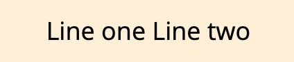
Let us say that I need to display the following text: 'First line\nSecond line'. Without the pre-line value, the browser treats newlines the same as other white space:
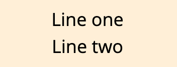
But with the pre-line value, the browser places the text over two lines:
Support for this keyword is good.
The attr function
A problem with HTML tables on mobile devices is that the table is often too wide for narrow screens. You need to scroll horizontally to see the whole table. This is generally an unsatisfactory user experience. I saw a good approach in this codepen. It involves styling an HTML table so that it displays well on both wide and narrow screens.
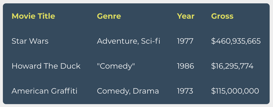
On a wide screen, the table displays as expected with the td cells in each row laid out horizontally:
But on a narrow screen, each table row has its td cells laid out vertically. The corresponding header value gets placed alongside each td cell value:
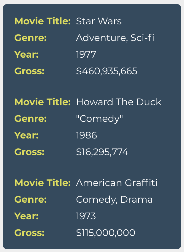
The markup does not change and no JavaScript is used. How is this transformation achieved? The header value for each pair, e.g., the 'Movie Title' text, is actually a :before pseudo element. Its content property value is the value of a data-th data attribute on its owner td cell. The markup for each row looks like this:
<tr>
  <td data-th="Movie Title">Star Wars</td>
  <td data-th="Genre">Adventure, Sci-fi</td>
  <td data-th="Year">1977</td>
  <td data-th="Gross">$460,935,665</td>
</tr>
The CSS magic to make this work is use of the attr function within the content property's value:
td:before {
  content: attr(data-th) ": ";
}
The attr function returns the value of the specified attribute on the targeted element. Support for it is good but only when used within the content property of a pseudo element. This function is currently not usable with other CSS properties. This technique also has the downside that the width of the pseudo element cannot be dynamically set. It has to be hard-coded to a value greater than or equal to the width of the longest column header text.
The owl selector
By default Web browsers style many elements with default top and bottom margins. This works very well when rendering prose, for example a blog post or a news article. With such content, the page consists of a sequence of headings, paragraphs, block quotes, lists, etcetera. Each of these elements has default vertical margin values and they collapse. Regardless of the order of the elements, there is always the correct amount of vertical margin between them. The result is an automatic rhythm to the vertical spacing of a page's elements. The blog post you are currently reading uses this approach for vertical margins. (The exact margin top and bottom values for each element type have been set to custom values.)
While this works well for prose, it does not work so well for other content. An example of this is the list of posts on this page. I have styled the listing as a grid of cards, one for each post. Each card includes the post's title, author, date, and a summary sentence. Here is a screen shot of one such card:

The card HTML mark-up is the following:
<li class="card">
  <h3>...</h3>
  <div class="byline">...</div>
  <p>...</p>
  <a>...</a>
</li>
If the card styling used the default vertical margins on the elements, the vertical spacing between them would be too great:

What would be better is the same vertical margin between each child, whatever the element type. We can do this in two steps:
- Removing the default vertical margins on each card's child elements.
- Adding the same vertical margin value between each card's child elements.
We can implement the first step as follows:
.card > * {
  margin: 0;
}
This CSS rule can be phrased as: "for every direct descendent an element with the .card class, set all its margin values to zero".
For the second step, we want a CSS rule that only applies vertical margin between adjacent child elements of the card. We do not want it to also apply vertical margin before the first child and after the last child. An elegant way to achieve this is to use the owl selector (a.k.a. lobotomised owl selector), which is *+*. This selector selects an element only if it has a prior sibling element. The rule to use in this card example is the following:
.card > * + * {
  margin-top: 8px;
}
This rule can be phrased as "for every direct descendent of an element with the .card class that also has a prior sibling element, set its margin top value to 8 pixels". Notice that the first child element will not get the margin top value applied to it, since it is has no prior sibling.
An alternative to using the owl selector is the following, but it requires two rules:
.card > * {
  margin-top: 8px;
}

.card > :first-child {
  margin-top: 0;
}
Conclusion
Modern CSS has a rich set of possibilities for styling HTML with compact rules. This post has detailed a few of them and I hope that you find them useful in your work.
Changelog
- 2020-04-21 Initial version
- 2020-06-28 Minor rephrasings and grammatical fixes
- 2020-08-27 Plain English improvements
# Comments
Comments on this site are implemented using GitHub Issues. To add your comment, please add it to this GitHub Issue. It will then appear below.