Introduction
I recently read a Web developer job specification that stressed the need for pixel perfect design implementations. I do strive to achieve this, but it relies on a close collaboration between developer and designer. A Web developer cannot just be a passive recipient of Web site designs. They should instead raise certain issues for discussion before work starts. These issues will be the focus of this post.
Note that I assume the designer is using Figma as that has been my recent experience.
Use a design system
Web apps and many Web sites benefit from being built using a design system. The design system should restrict the choices available to the designer. With these constraints, designs will be consistent and easier to construct and maintain.
Consistency is important for a good user experience. It also simplifies the process of translating designs into HTML and CSS. This results in less clarification between developer and designer about design details. The aim should be designs that have a single source of truth for every element. By updating that single source of truth, the change gets applied to all usages. In Figma, use components, variants and component swapping to achieve this. (There are currently some limitations with variants and component swapping in Figma. In particular, overrides do not always persist over a swap.)
Constrain the design system to a reduced set of choices for each aspect. This simplifies both the design system and every choice made when creating a design. It will also be more obvious to the developer which values they should use for a given design element. This can sometimes allow the developer to work from a wireframe instead of always requiring a design. If the team can skip the design step in the development process then they will reduce their cycle time. A design system that is too fine-grained will miss out on these advantages.
The core of a design system consists of the permitted font styles, colors, icons, and spacings. From my experience, the permitted spacings are most likely to be missing. Instead, the design system might allow arbitrary values. Or it might allow any value so long as it is exactly divisible by some number. These options do not make for a design system with the advantages covered above. It is best to use a defined set of values. This should form a geometric scale. This is a scale where the gaps between allowed values get larger as the sequence progresses. This post by Nathan Curtis is a good guide to the topic.
Use Figma's auto layout and layout grid options
Figma includes auto layout and layout grid options on frame elements. They are analogous respectively to flexbox and grid in CSS. Use them to create the design system and the designs. Their use will encourage consistency. The layout is controlled automatically rather than through manual positioning. It is also straightforward for the developer to recreate the designs in the browser.
These layout options also allow the designer to explore and specify the responsive behaviour of a design. They are very useful for specifying the layout between each breakpoint, not only exactly at each breakpoint. If the developer has the ability to resize layouts in Figma then they can see for themselves how a layout should resize.
Decide how to handle text leading
Consider the following scenario. The designer creates a card design that consists of a heading followed by some summary text. The designer uses auto layout for the card's layout. They also opt for a gap all around of 24px between the outline of the card and the text. This will look like so:

Notice that there is extra whitespace above the heading and below the summary text. This is in addition to the 24px gap:
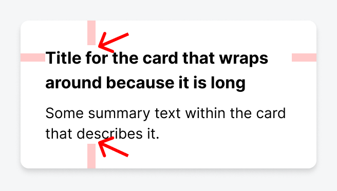
This is due to the half-leading model used in Figma for line height. In this card example, the heading has a font size of 16px and a line height of 24px. With half-leading, the difference between the font size and line height is equally distributed above and below the text.
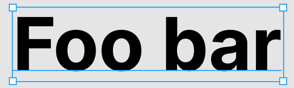
Also, even though the font size is specified as 16px, the glyphs in the font do not always fill that height. For example, consider Helvetica Neue. There is a gap between tops of the Latin alphabet's capital letters and the top of the font's bounding box:
Figma has the same half-leading model that is used in CSS. The developer can reproduce this card design perfectly in the browser. But the designer might want to drop that extra vertical space. If so, the design would instead be the following:
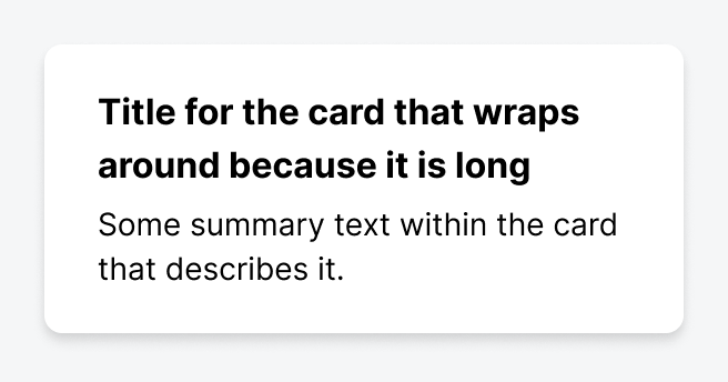
The extra vertical space has now been trimmed:
The developer can recreate this design in CSS using negative vertical margins. (This is best done using pseudo-elements.) The downside is that the margin values to use are specific to the particular font family and font size. If the browser has to substitute a different font then the text is unlikely to be vertically positioned correctly. The ultimate solution is the proposed leading-trim CSS attribute. This will make the process of trimming leading both trivial and configurable.
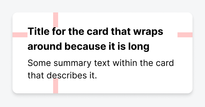
The real problem with this card design is from the perspective of the designer. They cannot have created this design in Figma using auto layout. Figma does not have a way to trim leading while using that layout option. The card design must have been manually sized and the text manually positioned.
There are currently only two viable options on how to proceed:
- Accept the extra vertical space for now. The team can consider removing it when Figma supports trimming leading.
- Remove the extra vertical space. But the designer cannot now use auto layout for text positioning in Figma.
Auto layout is too important a tool to lose so I would suggest that the first option is currently the best option.
For more information on trimming leading, please see this post by Matthias Ott.
Prefer to use a font size of 16px or larger for input elements
Nowadays we create responsive Web sites that work well across many devices. This includes mobile phones. The Safari browser for iOS has a particular behaviour for input elements with a computed font size that is less than 16px. When the user interacts with such an element, the browser automatically zooms into the page to enlarge the element. But when the element loses focus, the browser does not restore the zoom level. This can be frustrating for users as parts of the page that had been visible are now hidden from view. The simplest solution is to always use a font size of 16px or greater for input elements.
Decide on the units to use for border widths, breakpoints, and everything else
You can specify the size attributes in CSS using a variety of units. These include em, rem, px, and ch. The advice I give is the following:
pxfor border widthsemorpxfor breakpointsremfor everything else
As you can see, there is a choice between em or px for breakpoints. (You could use rem instead of em, but em is better here due to Safari bugs.) Breakpoints are often specified in px. But this can be problematic when the user has increased their browser's font size setting. Text might struggle to fit in the available space. As an example, consider the BBC News site. At a viewport width of 1024px and with a font size of 'Medium' in Chrome, one section of the site looks like so:
If I increase the browser font size to 'Very large'—with no change in viewport width—then the text increases in size. But the layout also changes, to that of a smaller breakpoint:
This layout change occurs because the site's developers specified its breakpoints using rem.
If I now simulate the effect of specifying the breakpoints in px then there is no layout change:
The result is that the card headings need to wrap more, and some might consider this harder to read. It is up to the designer and developer to decide which behaviour is preferred.
Decide how to style focus rings (without breaking accessibility)
Designers and clients often decide that focus rings are an unsightly addition to a Web site. Even so, they are important for accessibility and so you should reject the idea of removing them. A compromise is to only show them when the user is using their keyboard to navigate the site.
Restrict use of hover
Hover as an interaction is restricted to mouse users. If used, it requires an alternative interaction to be created for non-mouse users. An example would be a tooltip that is shown by hovering over or touching an information icon, as long as the icon looks suitably 'touchable'.
But my experience of implementing hover interactions has generally been negative, particularly with hover on navigation elements. Examples of such elements are menus that open on hover or sidebars that expand on hover. There can be unexpected interactions with these, both between the hover interaction and the alternative interaction for non-mouse users, and with elements showing on hover at unexpected moments. An example of the former is the sidebar that expands either on hover or when the user clicks or touches an expand button. The mouse user could go to click the button, but the sidebar expands as they move towards it and they end up clicking on a different control, one that has moved to where the expand button was.
Avoiding hover as much as possible will avoid such headaches and any hacks that get added to fix the resulting problems.
Conclusion
Designer and developer need to collaborate to produce designs that can be accurately and successfully recreated in the browser. In this post I have detailed some best practices and decisions that they should jointly make to achieve this.
Changelog
- 2021-10-20 Initial version
- 2021-10-21 Plain English improvements
- 2021-10-22 Added Figma layout links
- 2021-12-20 Minor wording changes
- 2022-03-17 Add a section about hover interactions
# Comments
Comments on this site are implemented using GitHub Issues. To add your comment, please add it to this GitHub Issue. It will then appear below.